Goal:
To specifically market platinum jewelry to our male target base customer. This needed to be done in a way that is brand appropriate, and elegant. Inspiration from the campaign came from our creative director that wanted a simple stunning, and elegant campaign that would compete with our largest competitors.
Limitations:
Photoshoots were not available, this had to be done using existing photography (lots of photoshop) and existing fonts.
Outcomes:
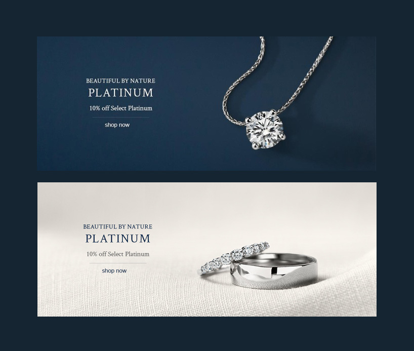
– Beige was used as an experiment to offset the blue and emphasize platinum’s silvery hue. It became a part of our brand colors after this campaign.
– The horizontal line was used sparingly for visual interest and to combine flat space with textured space. It is not seen on site rotators or banners.
– The campaign was received well and generated high revenue. It was scheduled to be repeated again the next year. The button was not changed by dev in time due to tight deadlines.
Website Rotators
I created the first rotator using web friendly fonts, and capitals were used to add old fashioned drama.

Mobile Rotators
All rotators and modules are also designed for mobile.

Mobile Sensitive Emails

Email Marketing
In these emails, I used the split to create contrast (white necklace/dark blue background) and make the necklace more visible.


Banner Ads
To complete the campaign, banner ads were distributed. These were simpler than the emails since they were smaller. This kept them elegant, and uncluttered at a time when many banner ads were overcrowded.
